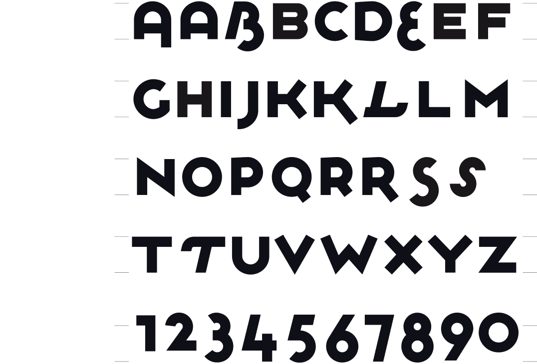
Construction method of the final version 1996
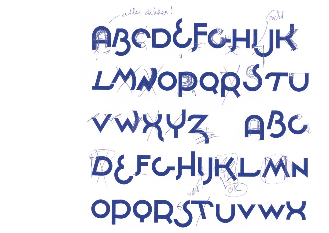
The initial design with indication of the adjustments in blue bic 1996
 BACK
BACK
PLOWBOYS
PLAYFUL AND STRONG
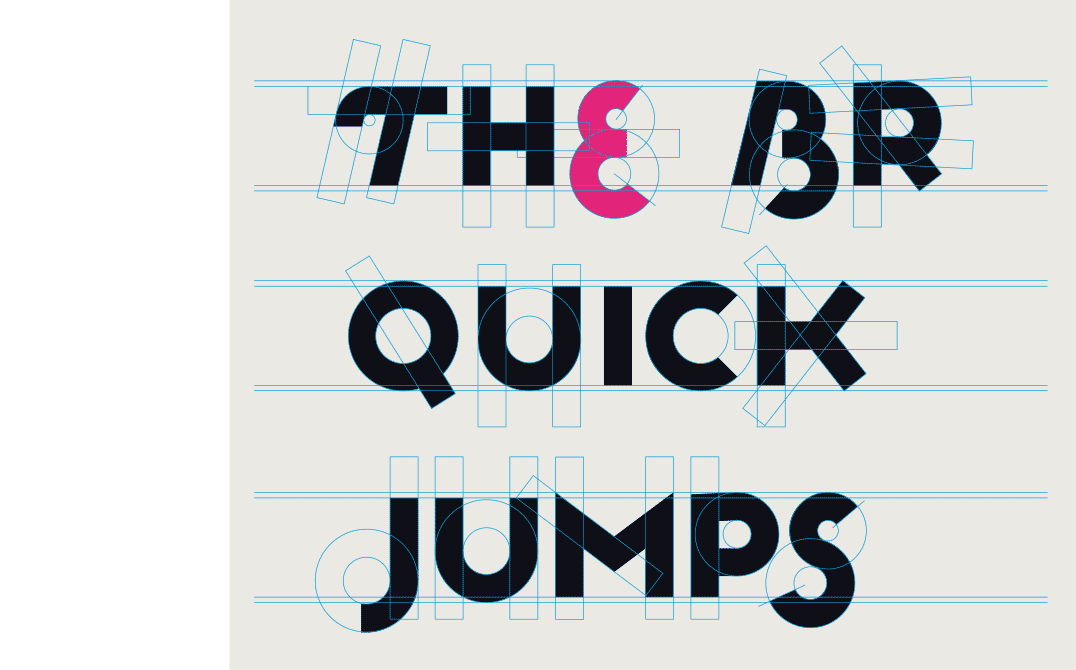
[1987-1996] While looking for a logotype I started to play with round shapes. For some letters like the E, S and B, I used two circles. In the same logic the O was one circle, and therefore smaller. All the straight letters were given the height of the O. This way, it became a font with 2 different heights, with all of the letters aligned at the top. The end result was this solid yet playful font.
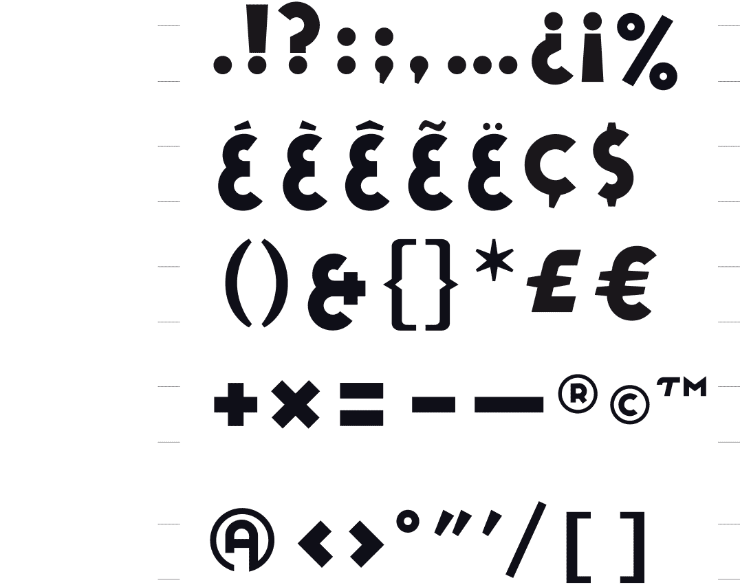
Issued in OpenType by Index Books (Spain/Brasil) as part of the book « Homage to Typography » by Pedro Guitton 2009
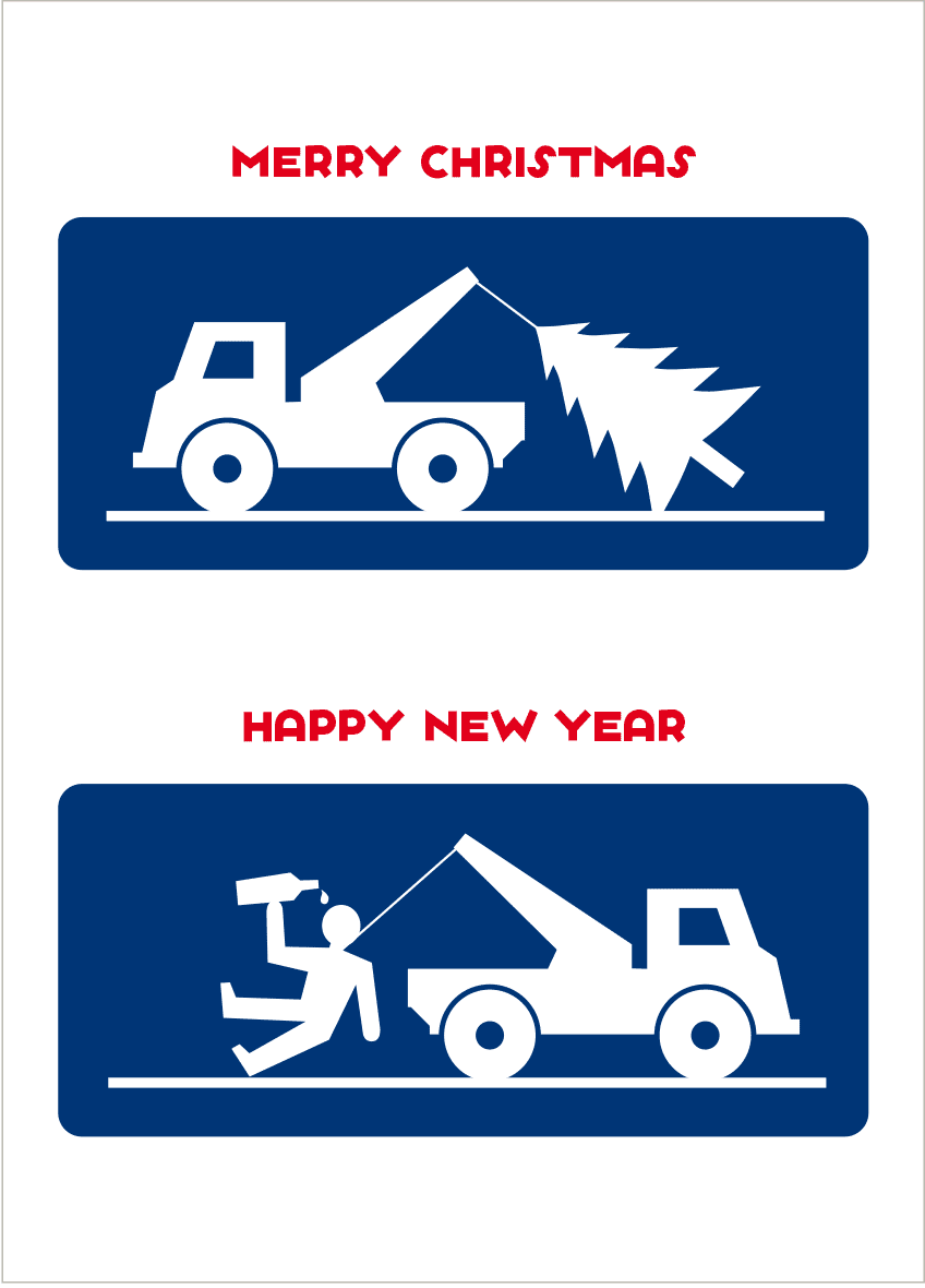
New year card published by Kartoenfabriek Ant-werpen and Discordia Postkarten Verlags GmbH Germany 2012
Dune, european distributor of universitary publications Amiens, France 2003
Poster on the ‘War on terror’ of US-president George W. Bush - from a series of personal posters with a political or social issue 2002
M&M, stand construction company, Schellebelle 1998
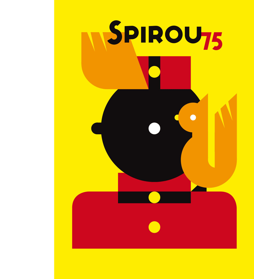
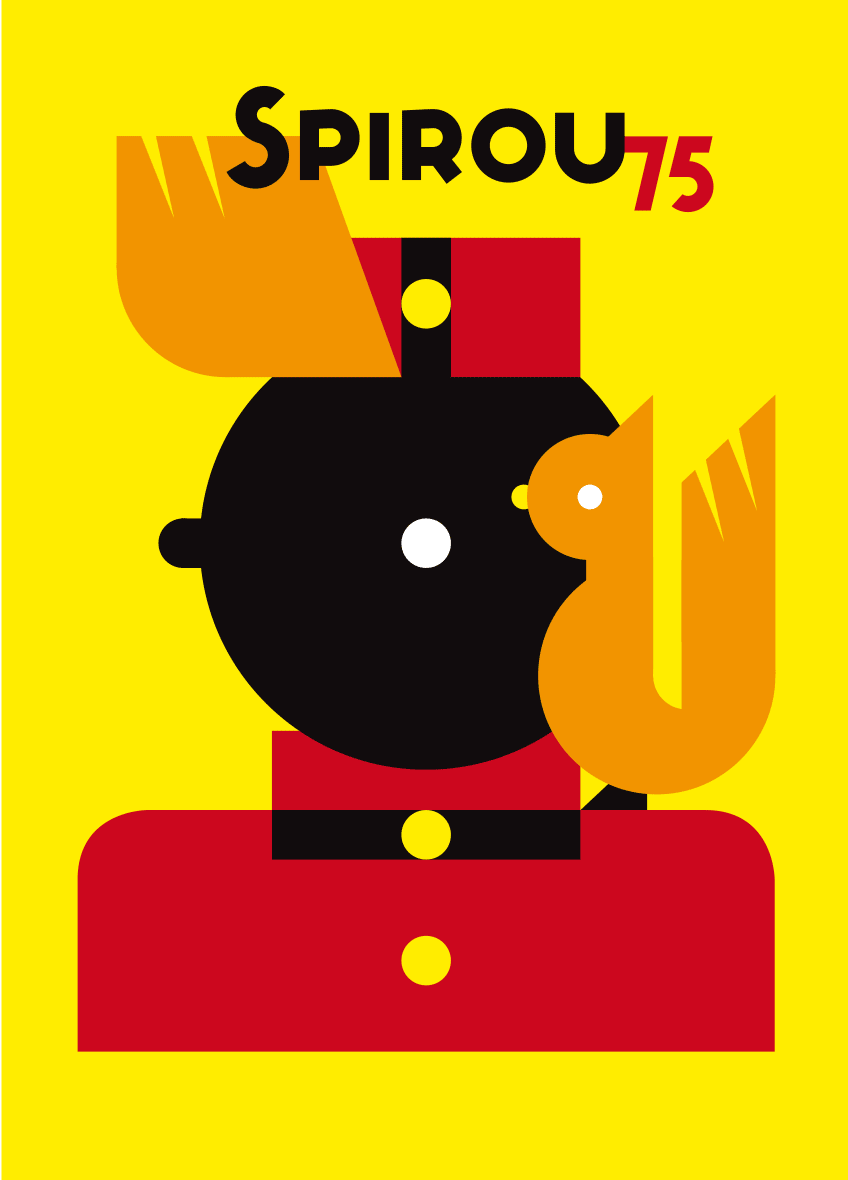
Homage « Spirou 75 years » poster & catalogue exhibition ‘Huis van het Beeld / La La Maison de l’Image’ Brussels 2013 - new year card 2014 Dupuis Publishing