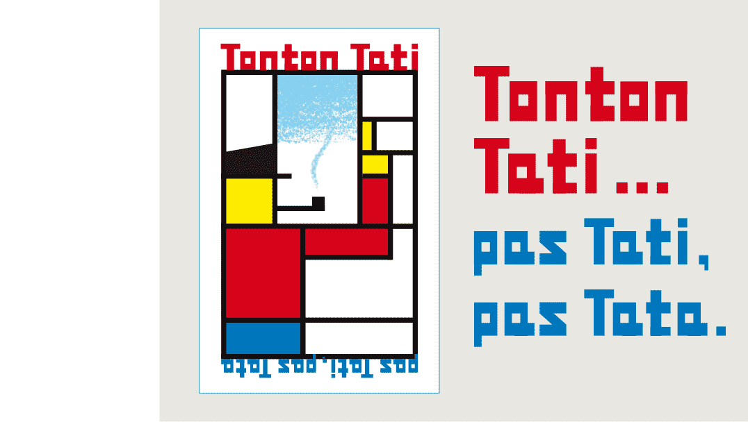
Poster study, unfinished because the result was not satisfying.
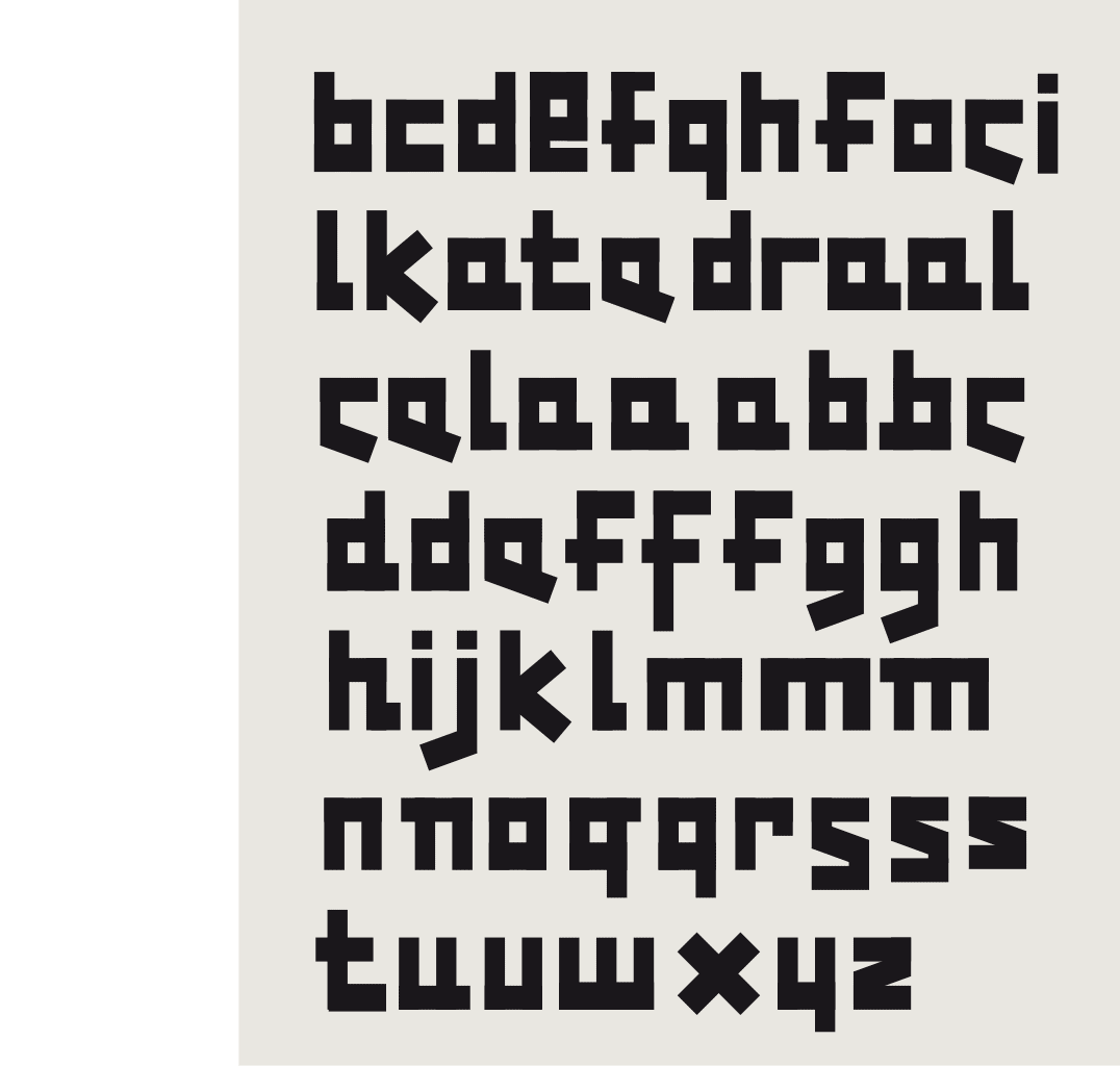
Construction sketches
 BACK
BACK
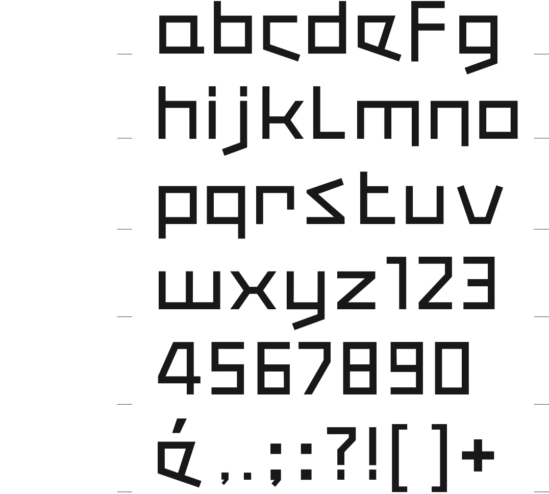
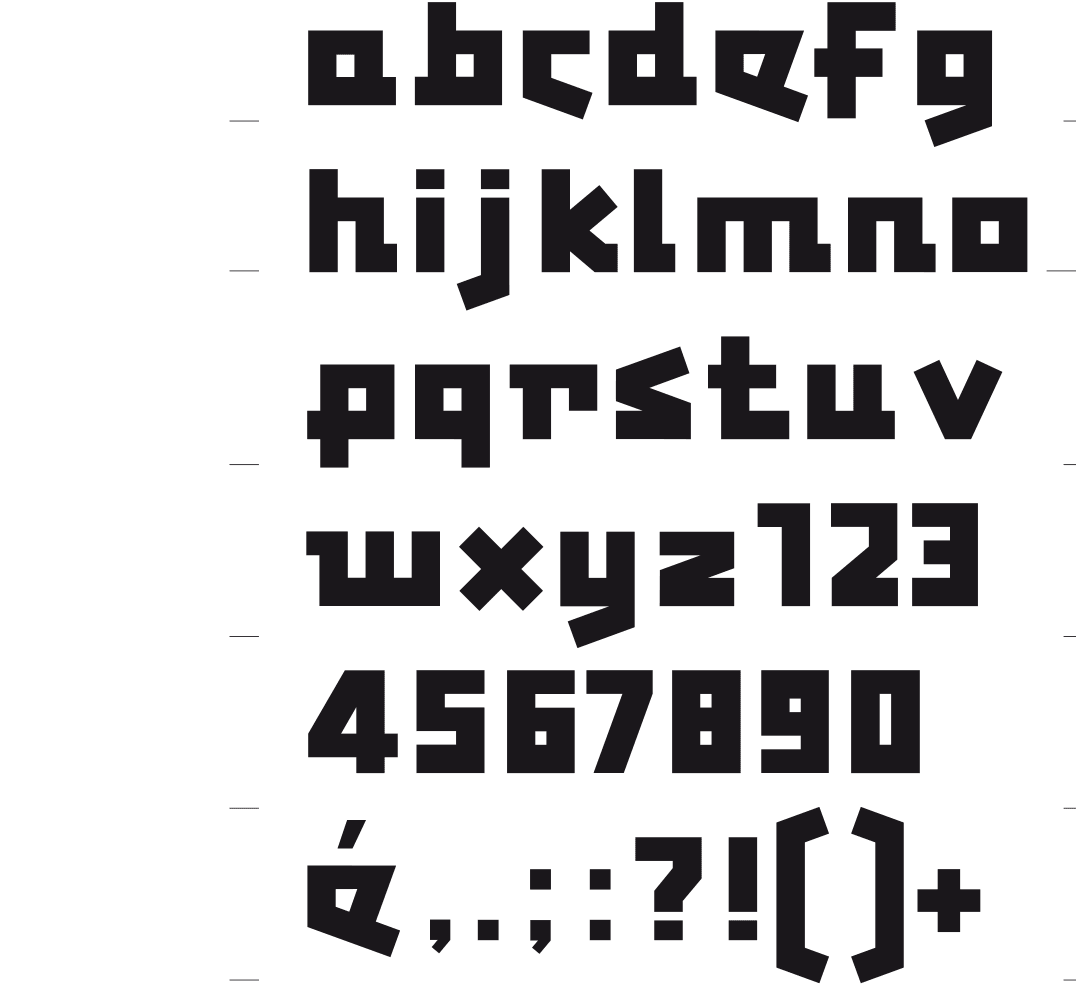
TONTONTATI BOOK & BOLD
BAUHAUS INSPIRED
This typeface was created as I was designing a poster for the exhibition «Jacques Tati & Friends» in 2009, a tribute to the famous French director. My first – unsatis-factory – sketch for the poster was based on the work of Piet Mondriaan. In order to have a matching font I drew the letters in a ‘creative’ Bauhaus style. When cleaning up, ten years later, I got the first sketches back in my hands. So, I did some further work on them. This font is now available in a thin and a thick version. One peculiar aspect is that they differ in terms of drawing. I thought that each thickness should have its own specificity, and not be a mere variant.
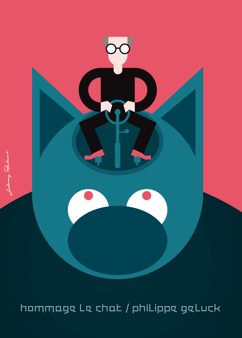
Poster for the homage to Philippe Geluck and « Le Chat » in the Maison de l’Image / Huis van het Beeld Brussels 2019