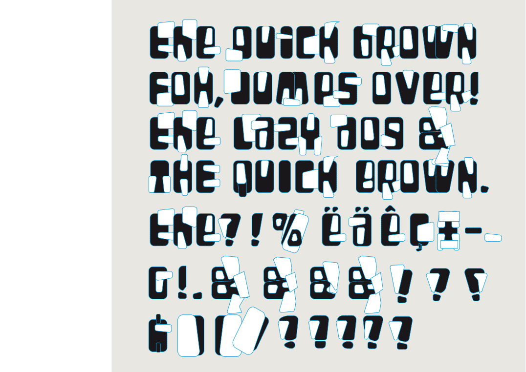
Construction method whereby shapes interfere with each other

 BACK
BACK
THEO & PHIL
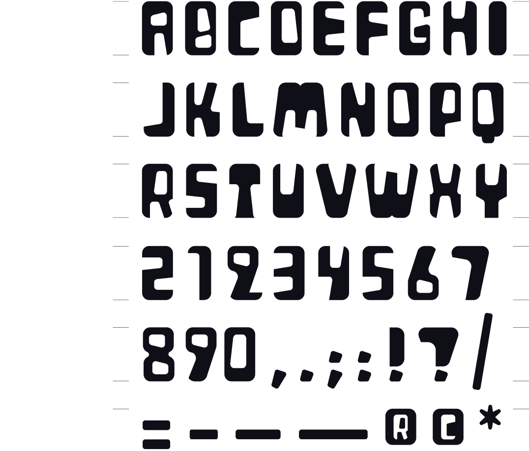
POP ART
[2000] The inspiration for this font came while I was working on a logo, playing with a black rectangle with rounded corners, from which white rounded shapes are cut out. In the end, I didn’t make a logo that way, but I did end up making a font that consists of shapes instead of lines. The font has a pop-art look that gives it a special sixties feel.
Issued in OpenType by Index Books (Spain/Brasil) as part of the book « Homage to Typography » by Pedro Guitton 2009
Book cover for a novella by Jan Pollet 1999, artwork Mandy Bekaert
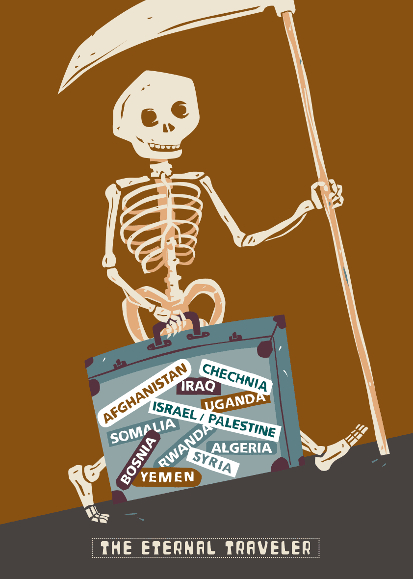
From a series of personal posters with a political or social issue 2002 – selected for the poster contest ‘To Death with a Smile’, Museo Mexicano del Diseño, Mexico City 2018
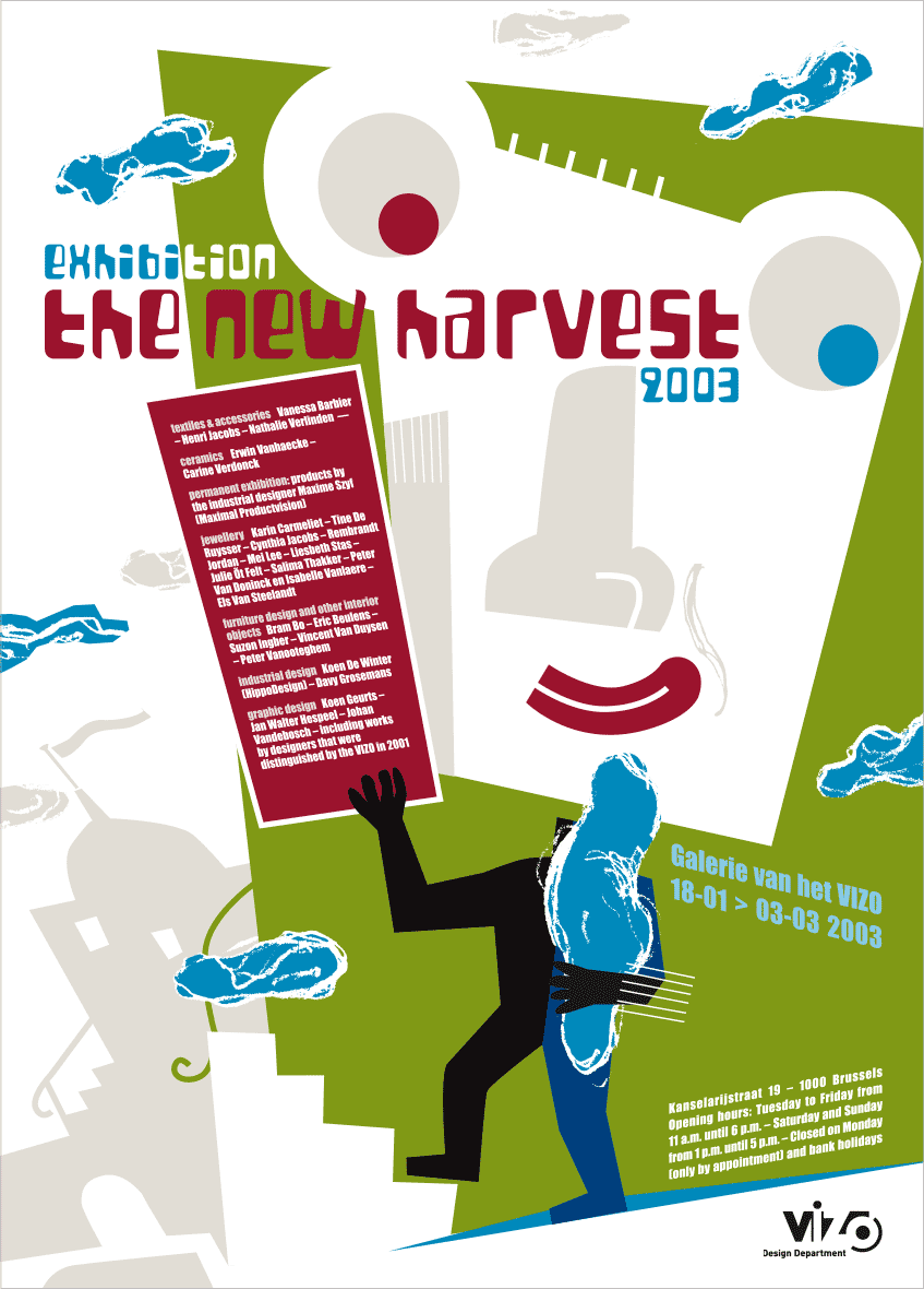
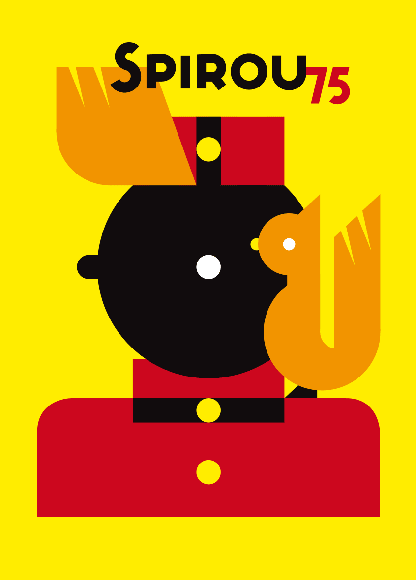
Poster exhibition « The New Harvest - De Nieuwe Oogst », VIZO - Design Vlaanderen Brussels 2003
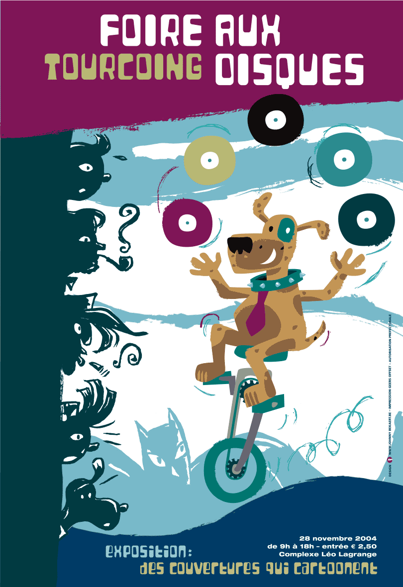
Poster Vintage Vinyl Fair Tourcoing, France 2004
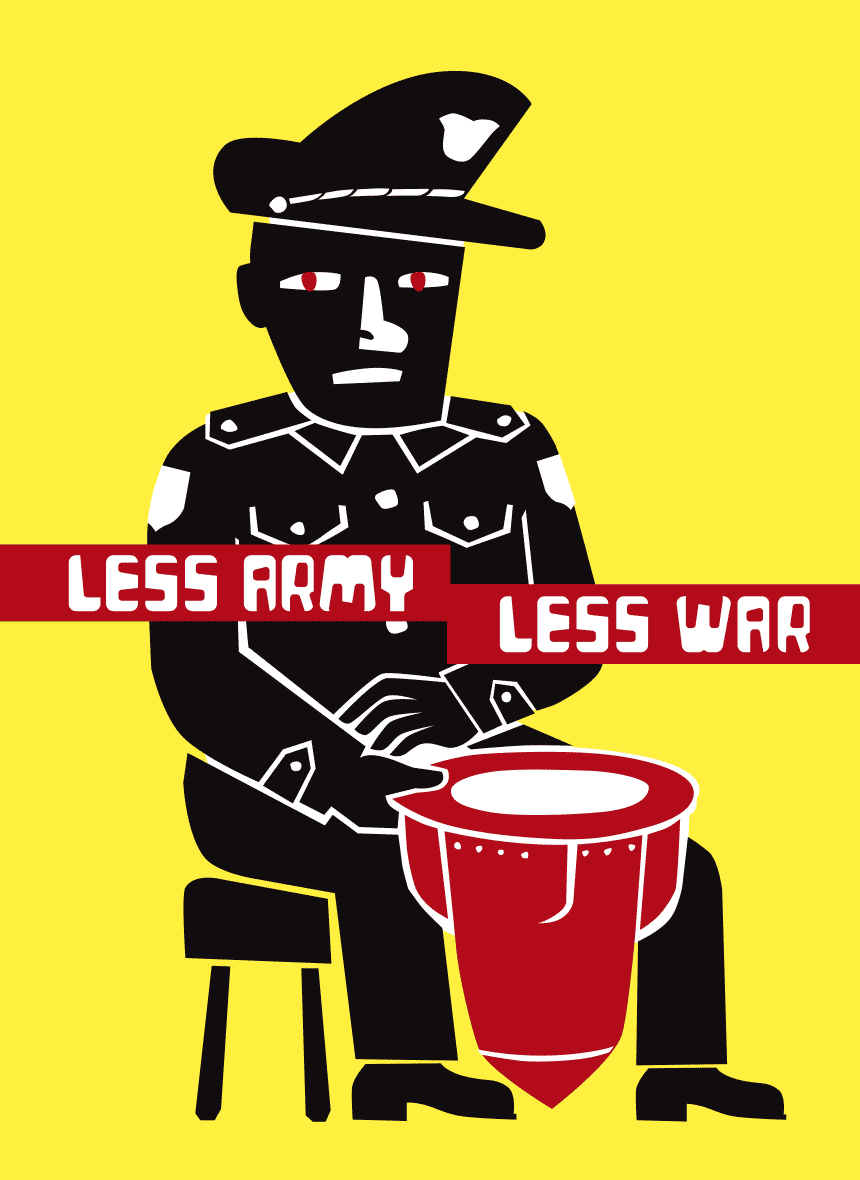
From a series of personal posters with a political or social issue 2003