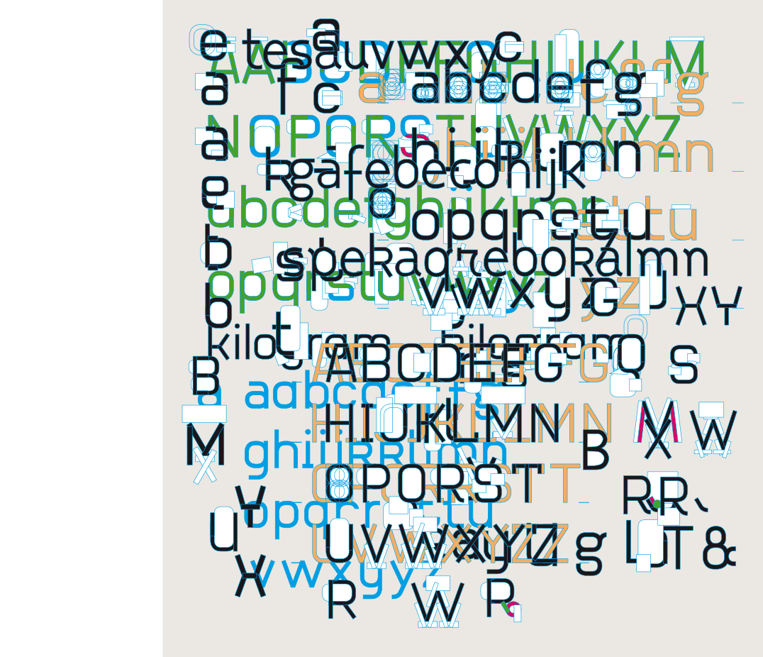
The search for the best possible shape of the characters
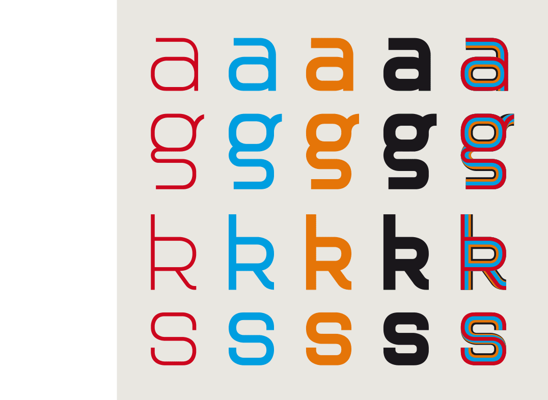
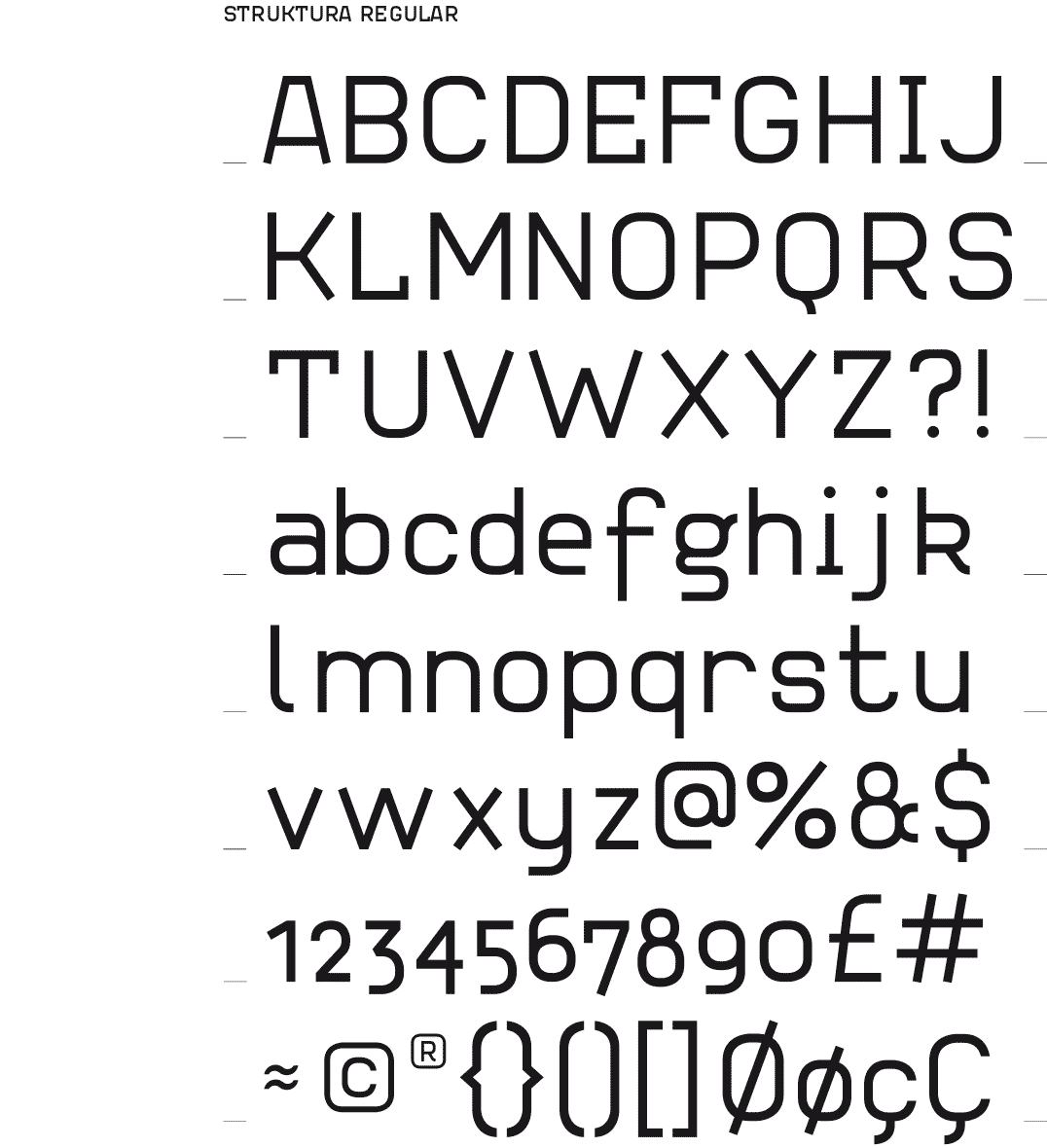
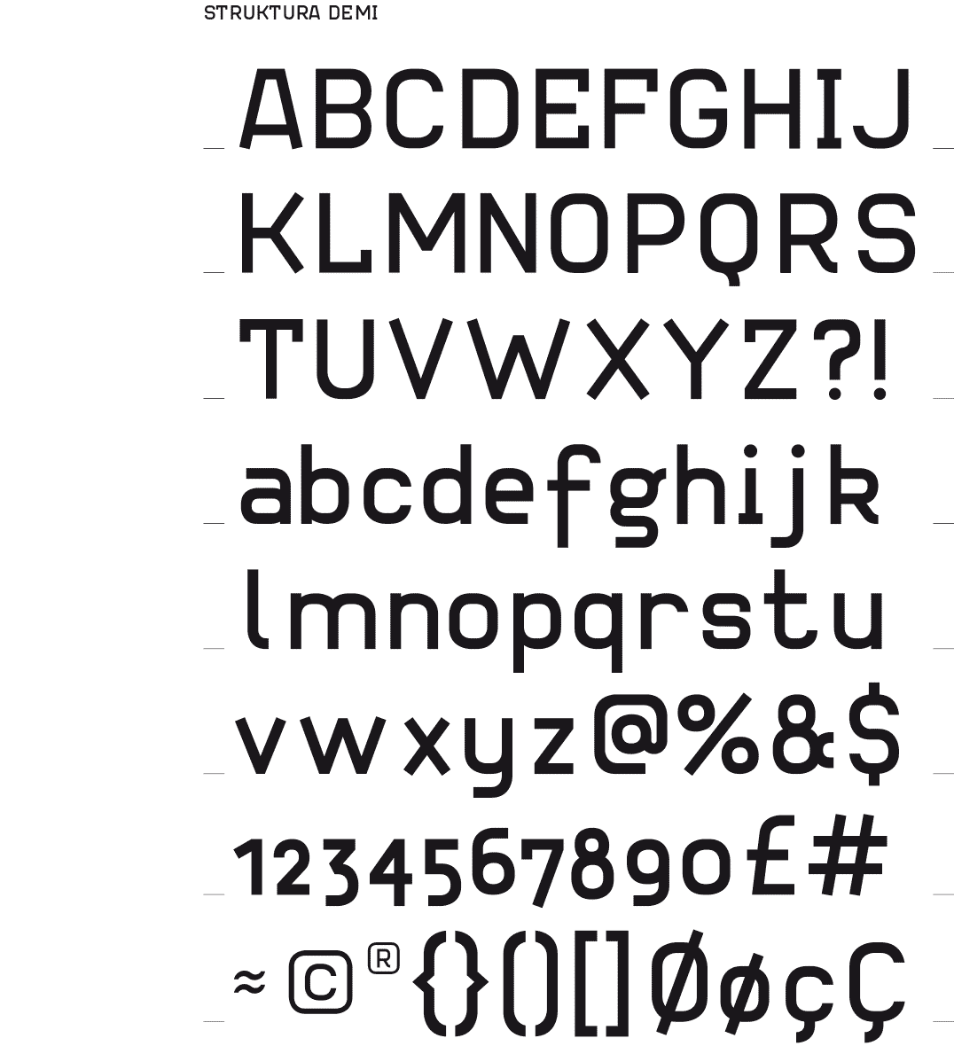
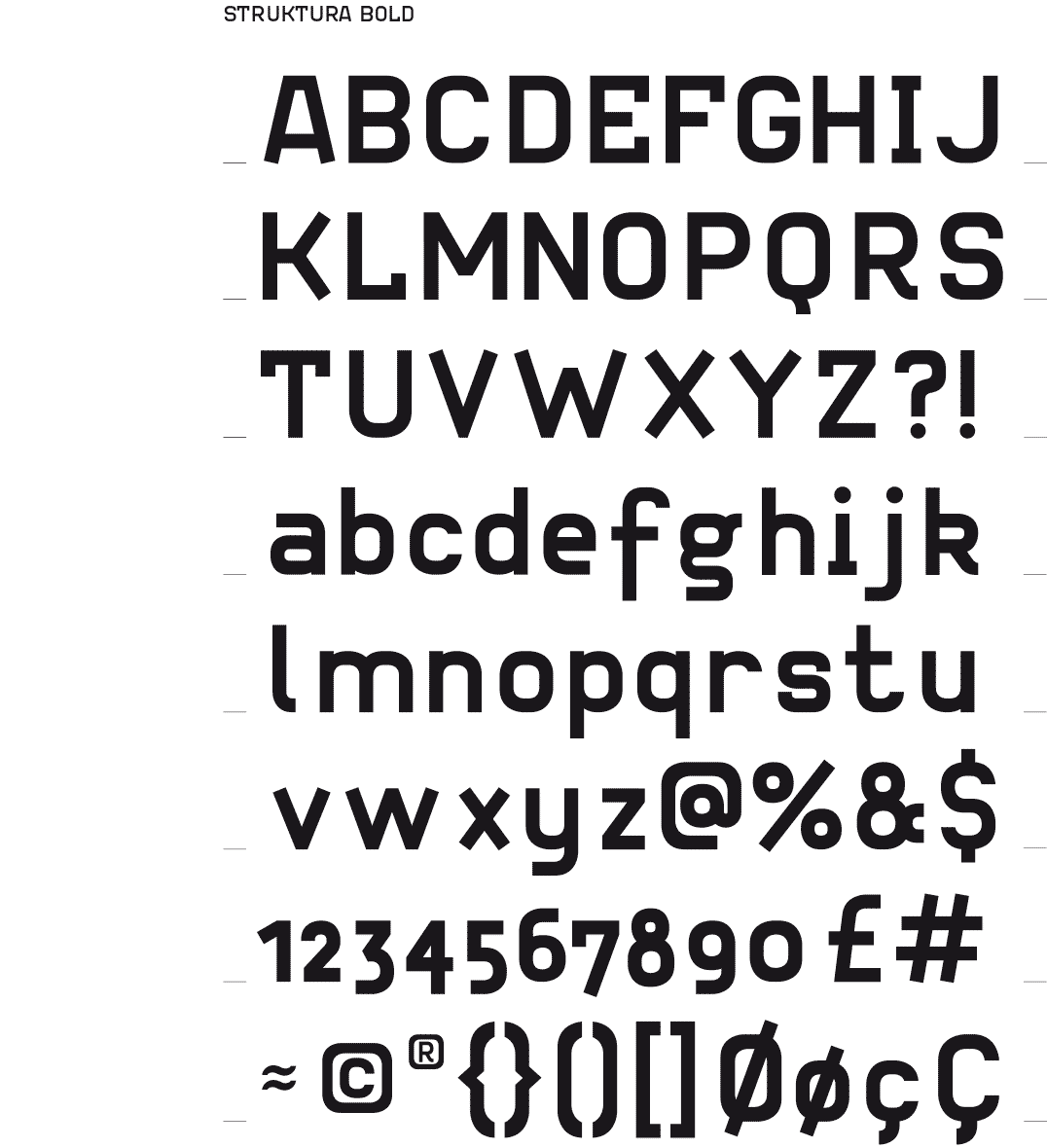
The four weights of the font and their superposition
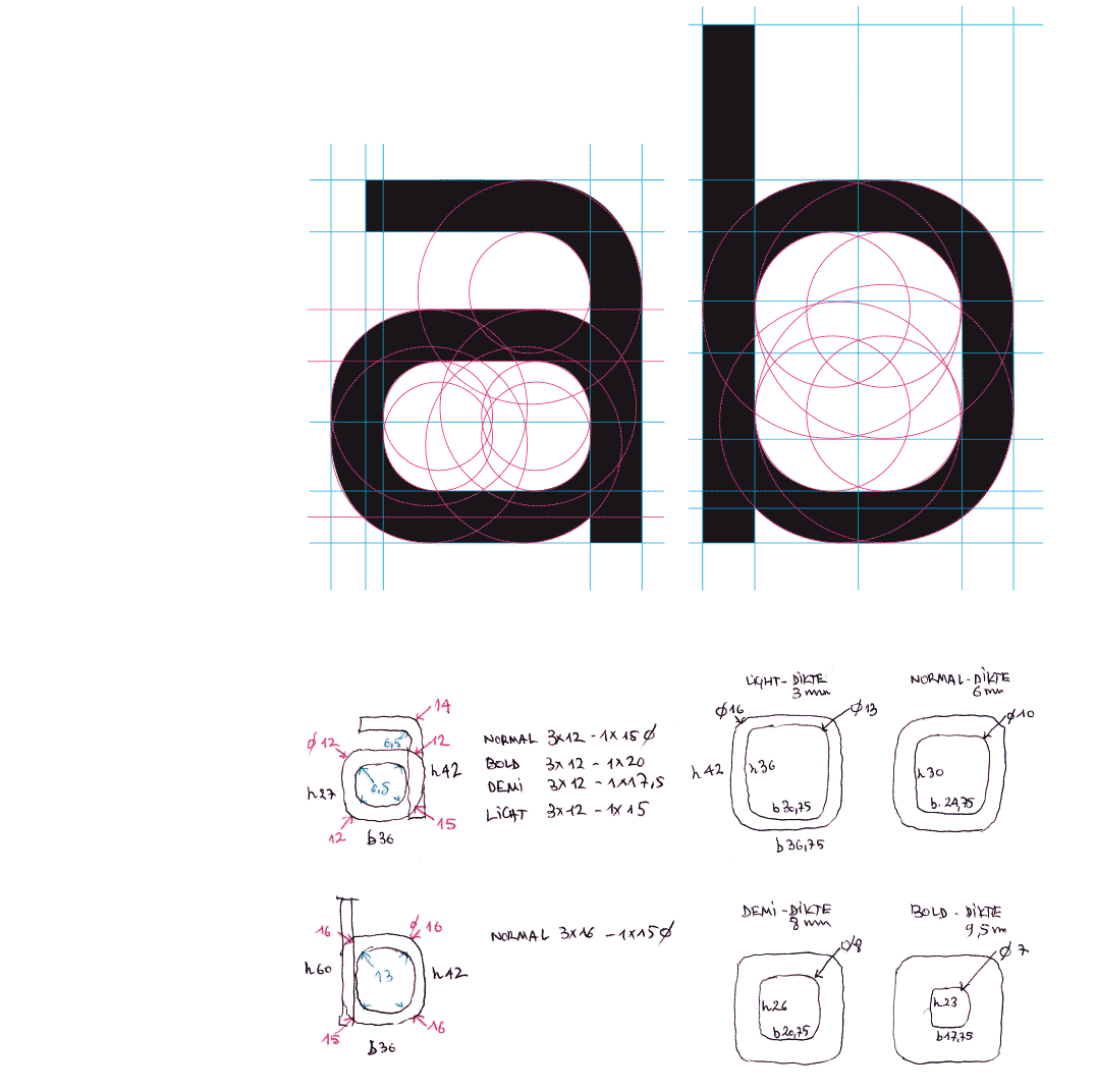
Construction lines of the characters - calculation of the radius of the different weights
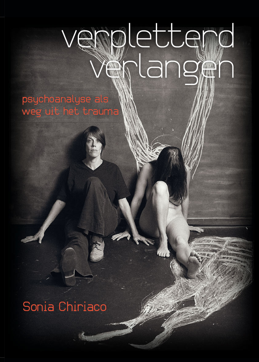
Book cover for an edition of the Circle for Psychoanalysis, New Lacanian School 2014 - photography Marc De Troyer
 BACK
BACK
STRUKTURA
TEXT FONT
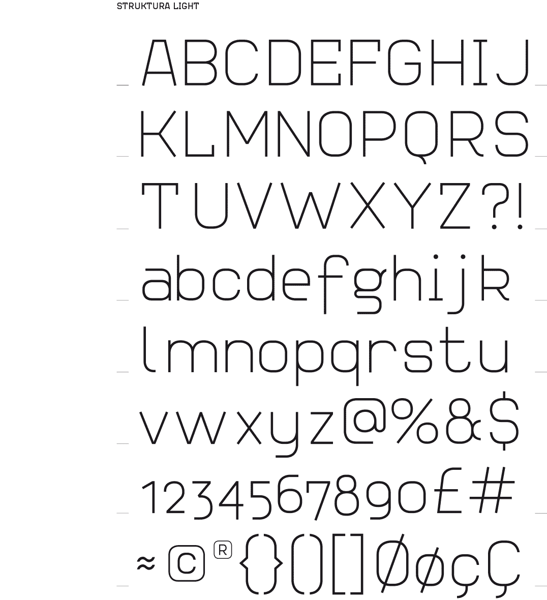
[…-2015] For several years I have been trying to design a text font. I know, it’s aimed very high. Especially for someone like me who works in several disciplines. While designing this Struktura font I had landed on a rollercoaster of doubts and hesitations, and at the same time hope.
Occasionally there was satisfaction but this was mostly of very short duration. It has taken several redesigns of the font, even of all weights, till the shapes eventually formed a whole.
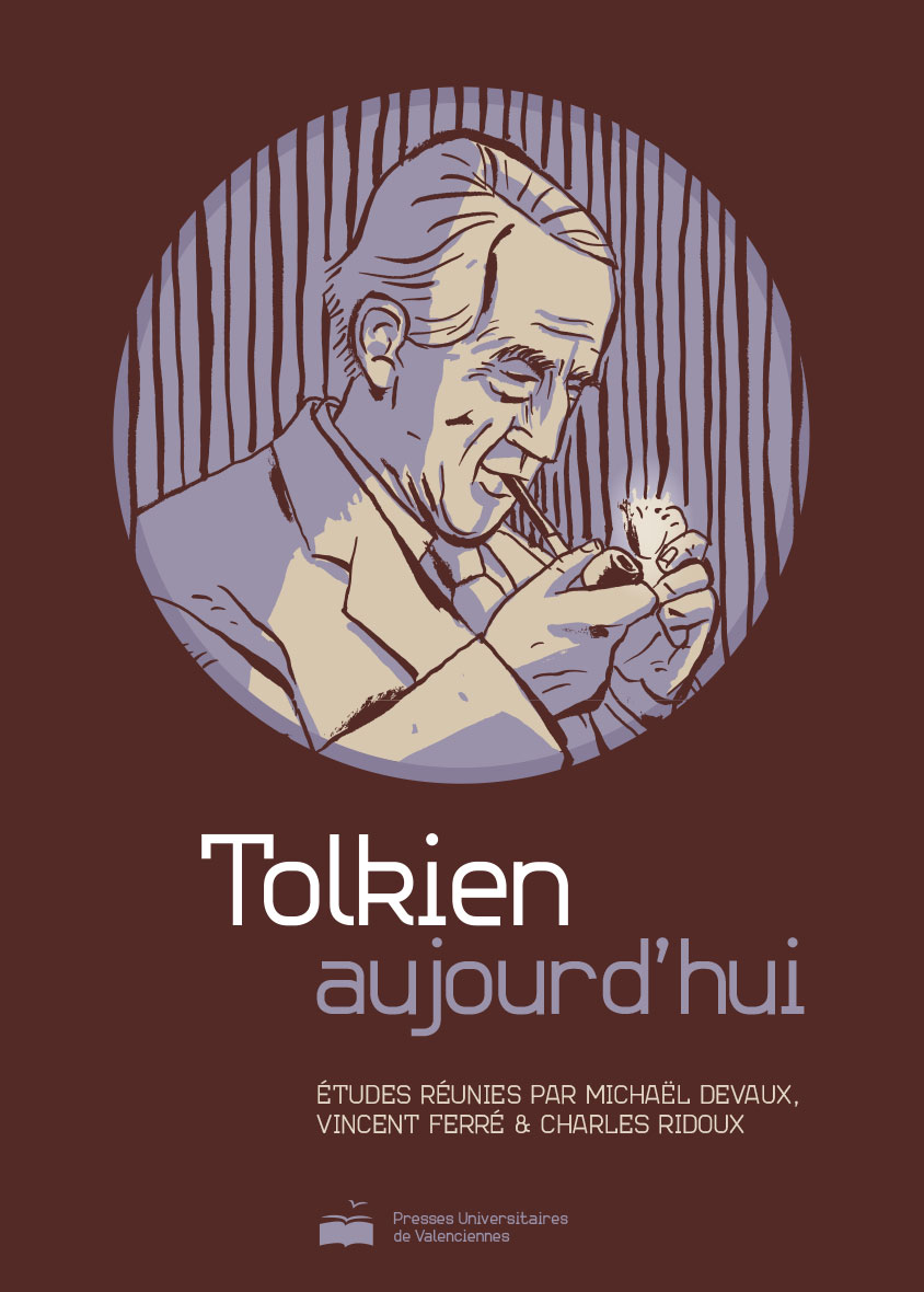
Book cover for a study of the works of Tolkien - Presses Universitaires de Valenciennes, France 2014
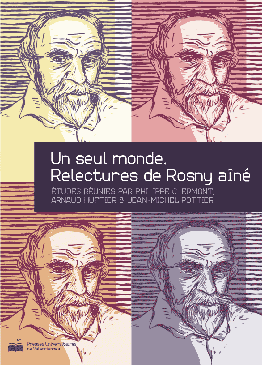
Book cover for a study of the works of Rosny aîné - Presses Universitaires de Valenciennes, France 2014
Book cover for an edition of the Circle for Psychoanalysis, New Lacanian School 2014 - photography Marc De Troyer
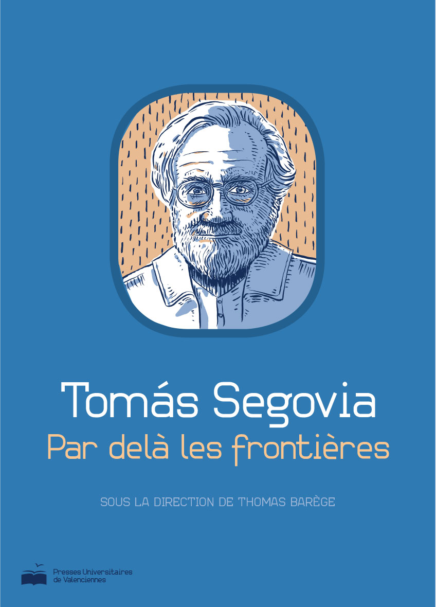
Book cover study - the works of Thomás Segovia - Presses Universitaires de Valenciennes, France 2014

Logo for a collection of books about Transport & Mobility - Presses Universitaires de Valenciennes, France 2014
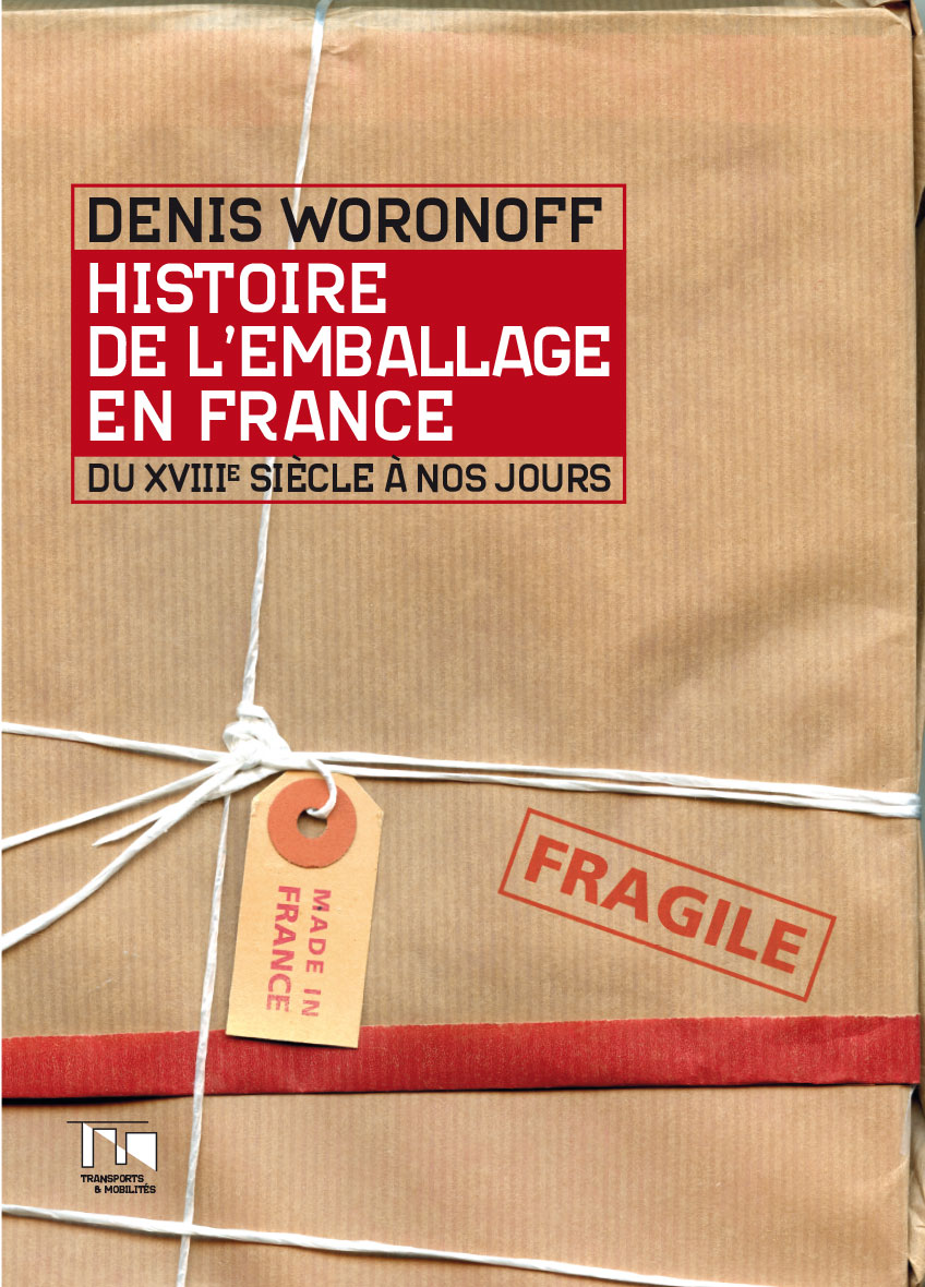
Book cover for the « History of packaging in France » - Presses Universitaires de Valenciennes, France 2014