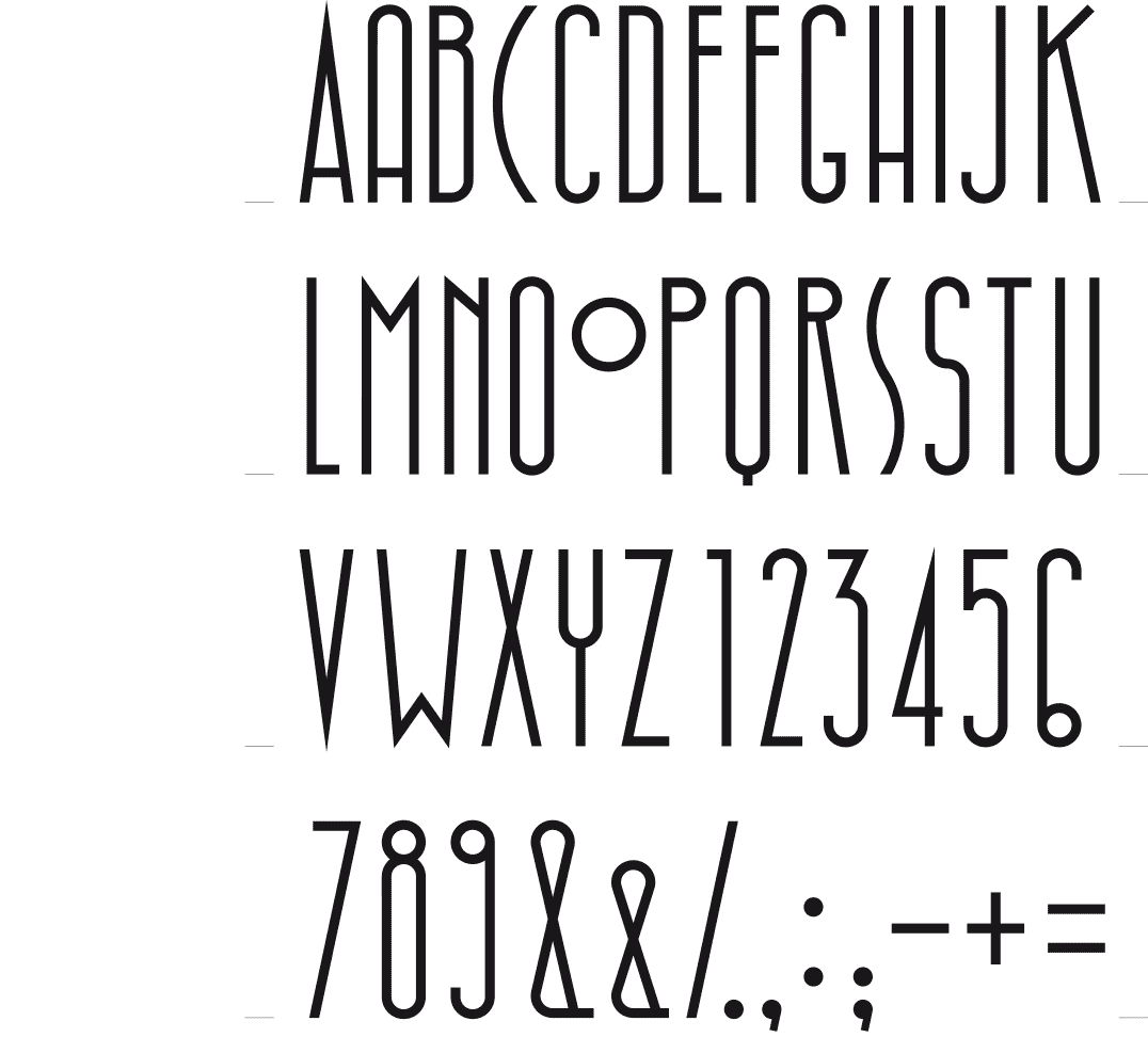
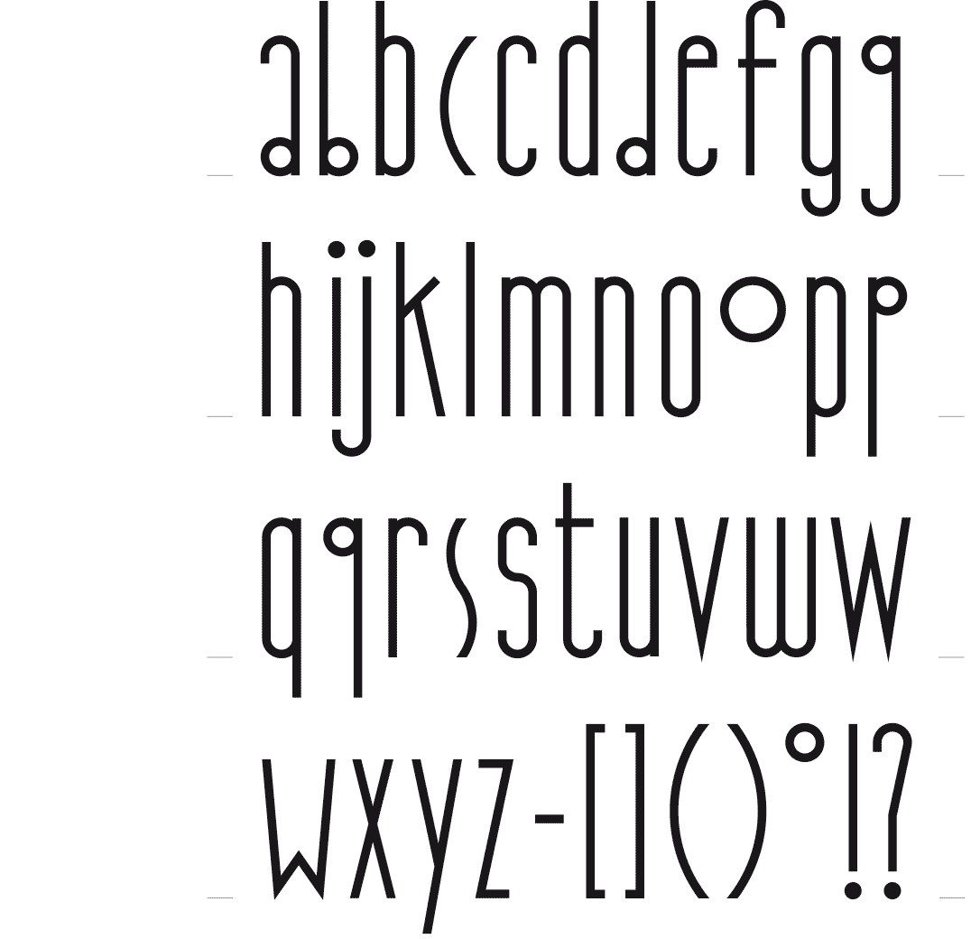
Construction study of the characters while redesigning the font in 1998
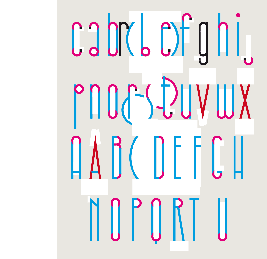
Study of some letters, looking for the best shapes and proportions
 BACK
BACK
HIBBLESIBBLE
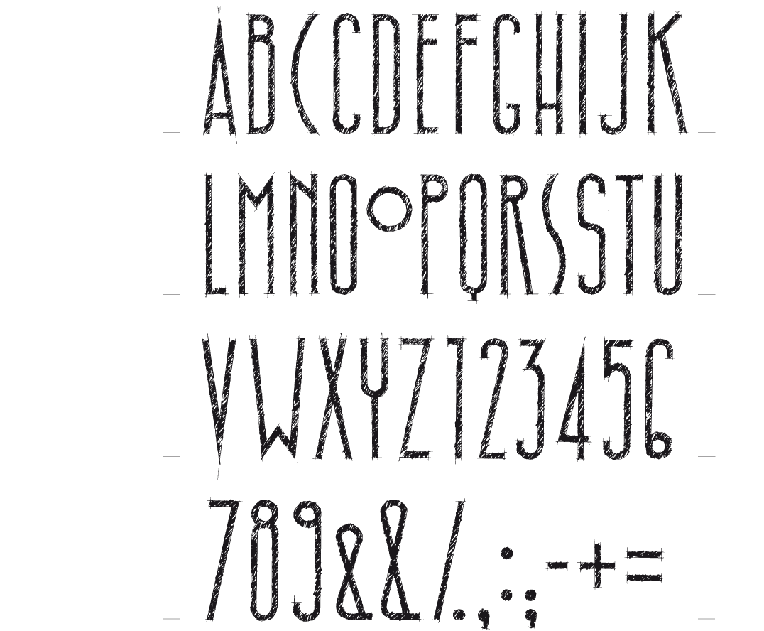
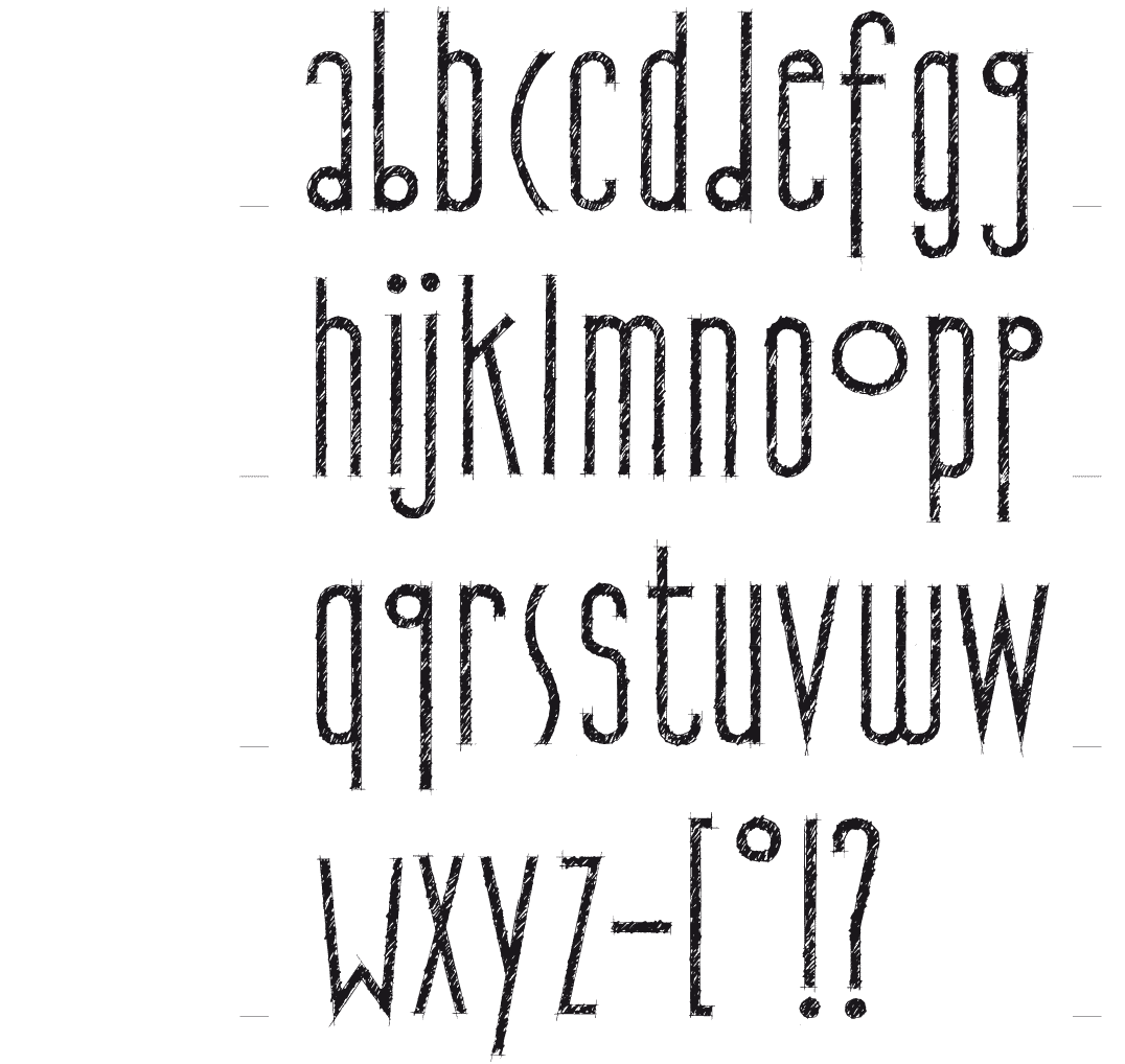
HATCHED AND STRAIGHT
The first characters of this font were designed to serve as the title of the poster. It’s a tight and narrow font, all drawn by hand, even the hatching. It was drawn on tracing paper with a 2B pencil, at a size of 7 cm. Afterwards I felt the need, as a contrast, to design a straight version of this font.
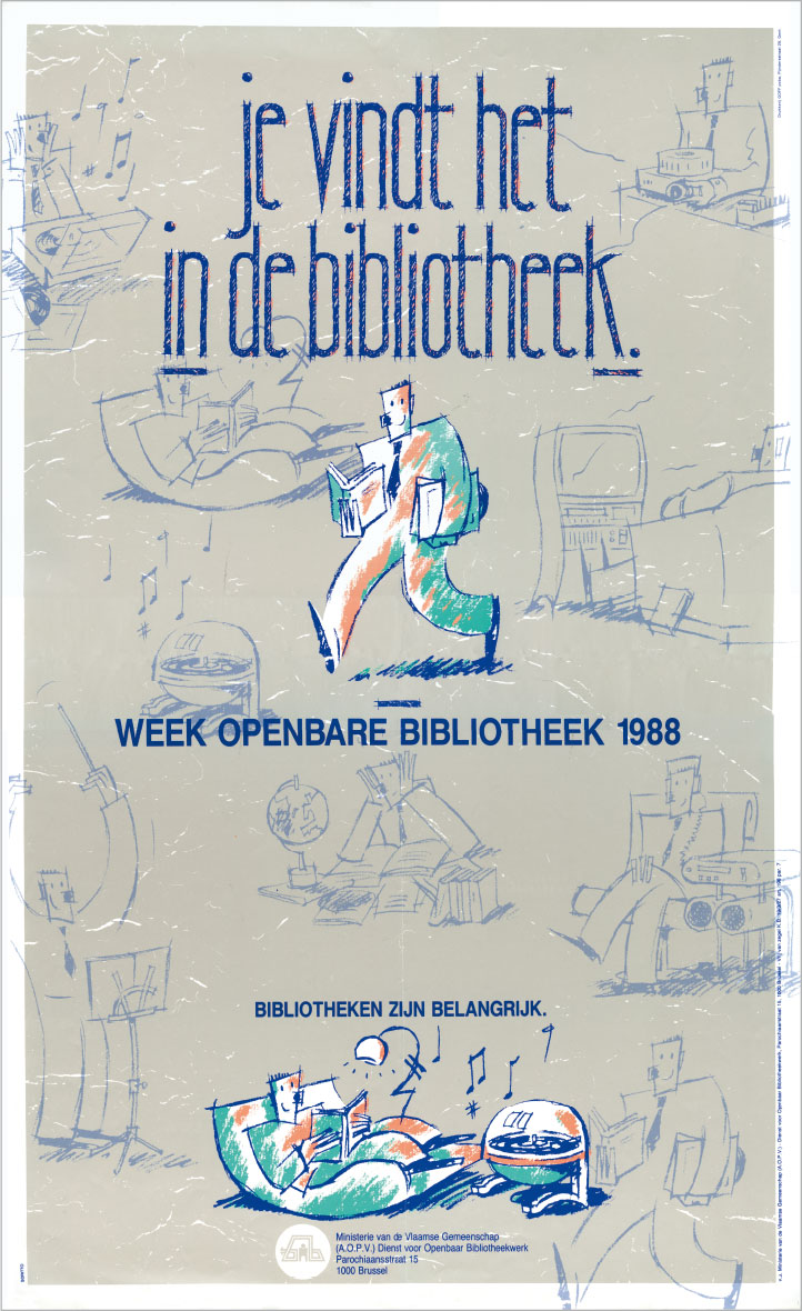
Promotional poster for the « Week of the public library 1988 »
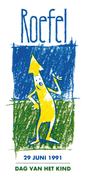
Mascot / logo for « Roefel, Day of the Child » an organization of the ‘Koning Boudewijnstichting’ 1991
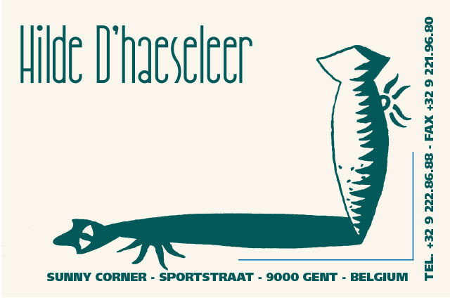
logo / business card for Hilde D’haeseleer, trendwatcher - design Jessika L’Ecluse 1992
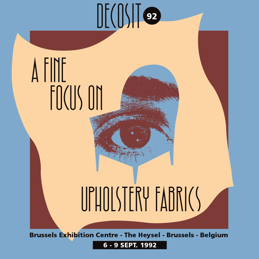
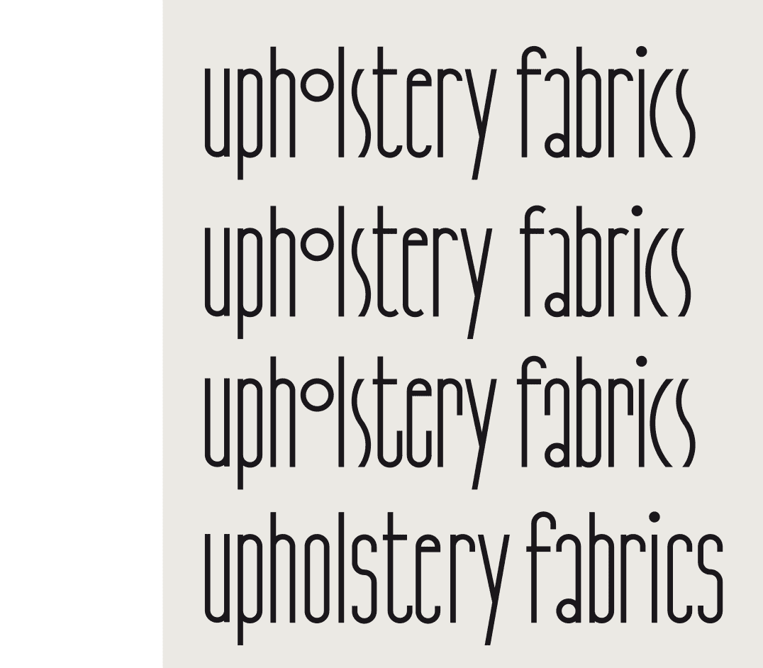
Font page brochure Decosit Fair of upholstery fabrics Brussels - design Pascal Leroy 1992