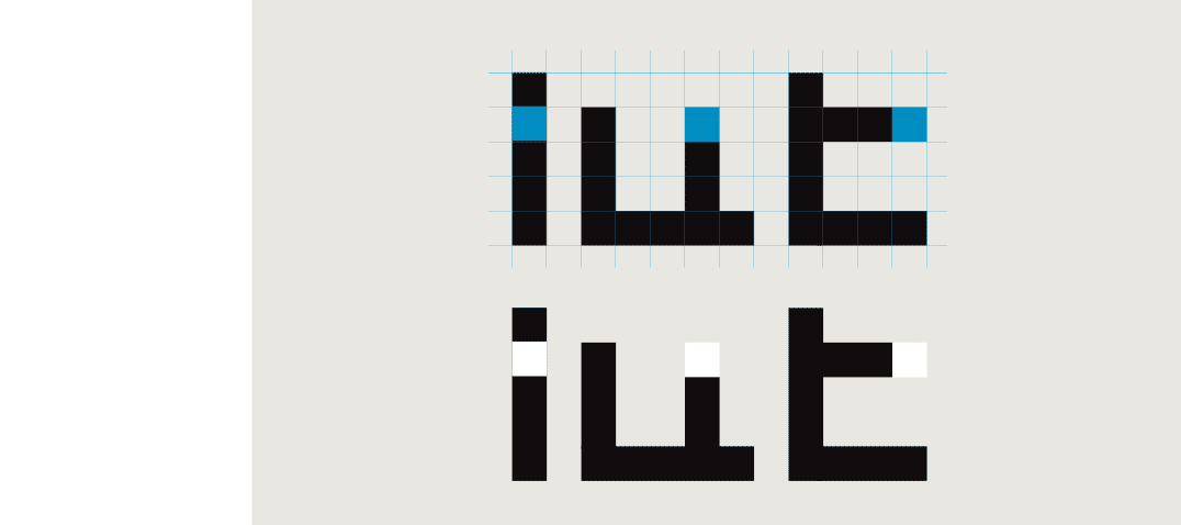
Construction method
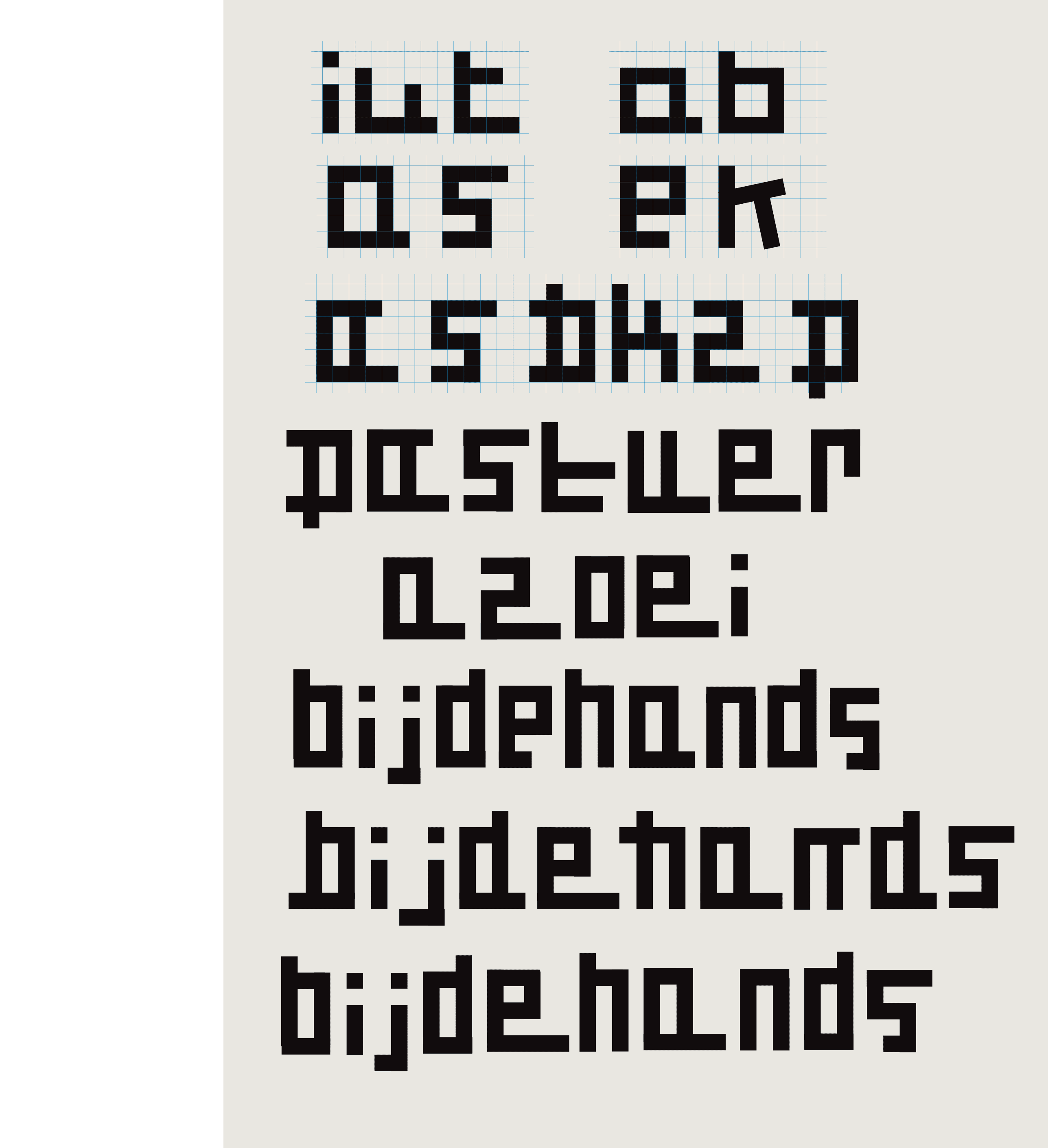
Construction sketches
 BACK
BACK
GRIDDO
DESIGNED ON A GRID
[2019] I was commissioned to realize the logotype for a department of a French university. In one of the proposals, I made a grid as the basis for drawing the letters.
Eventually, another of my proposals was chosen. Nevertheless, I was so enthusiastic about this grid that I continued to build on it.
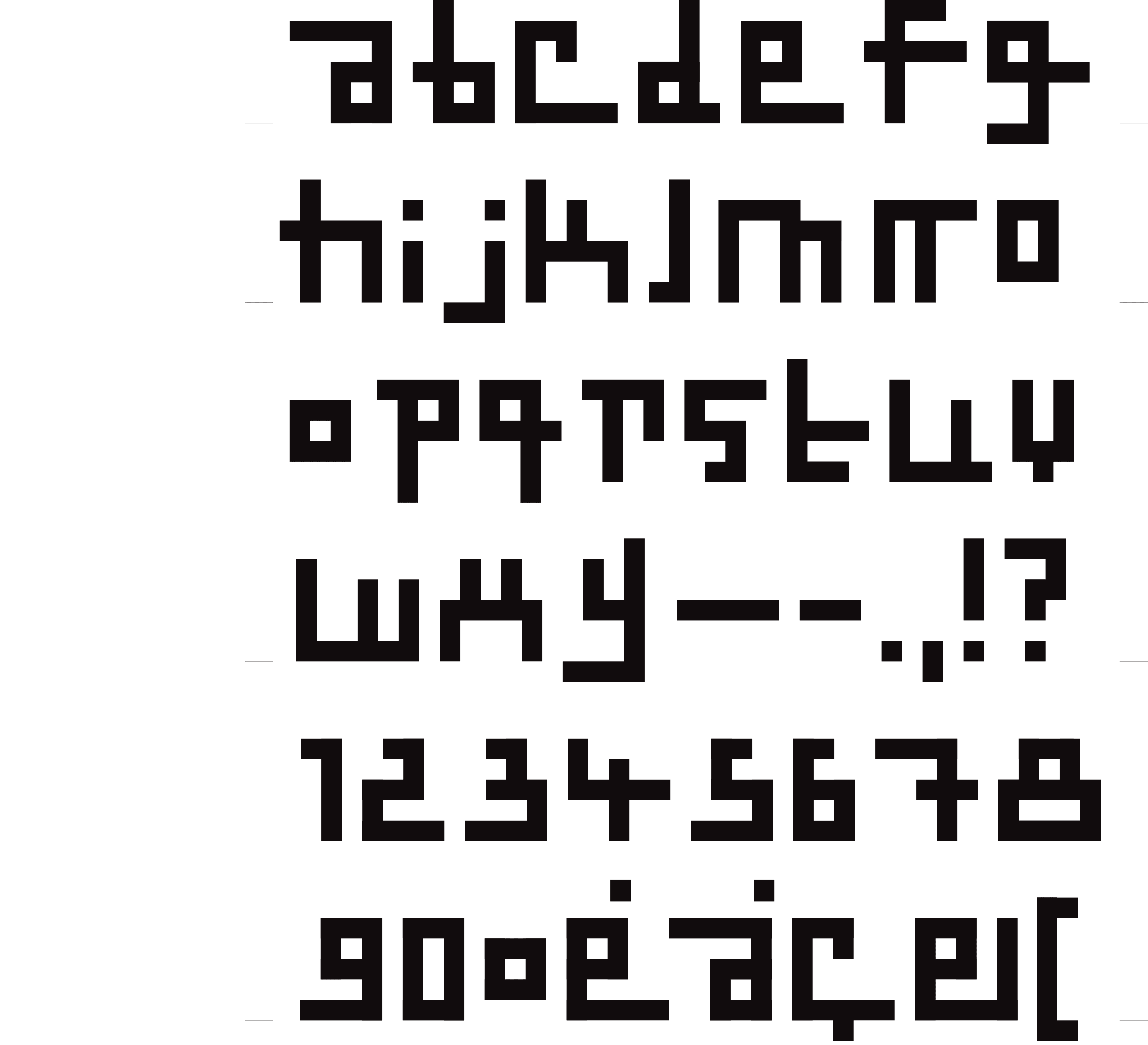
Countless fonts were already designed on a grid, so I wanted to use this grid as a basis to play freely, with the intention to bring the letters to the edge of legibility.
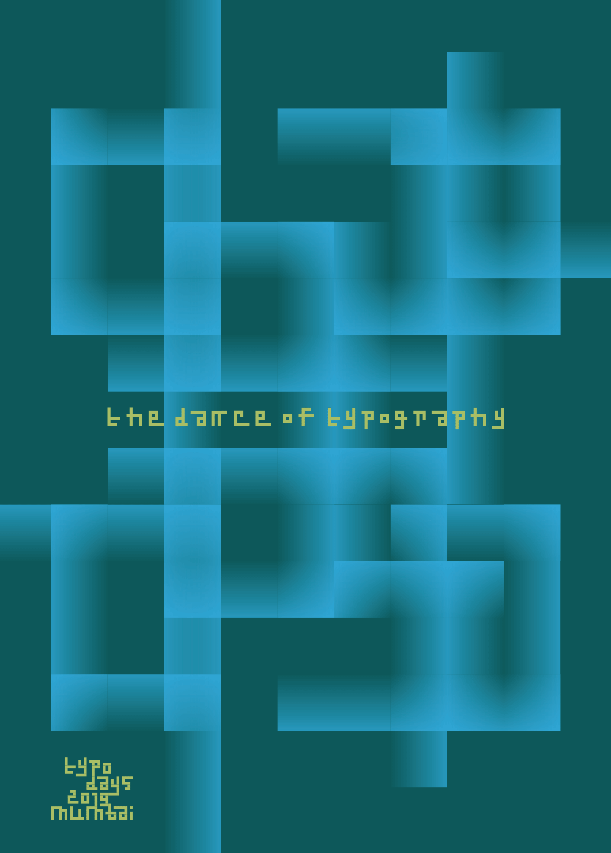
Poster for the ‘Typography Days 2019’ on the theme of ‘The Dance of Typography’ Mumbai India - 2018
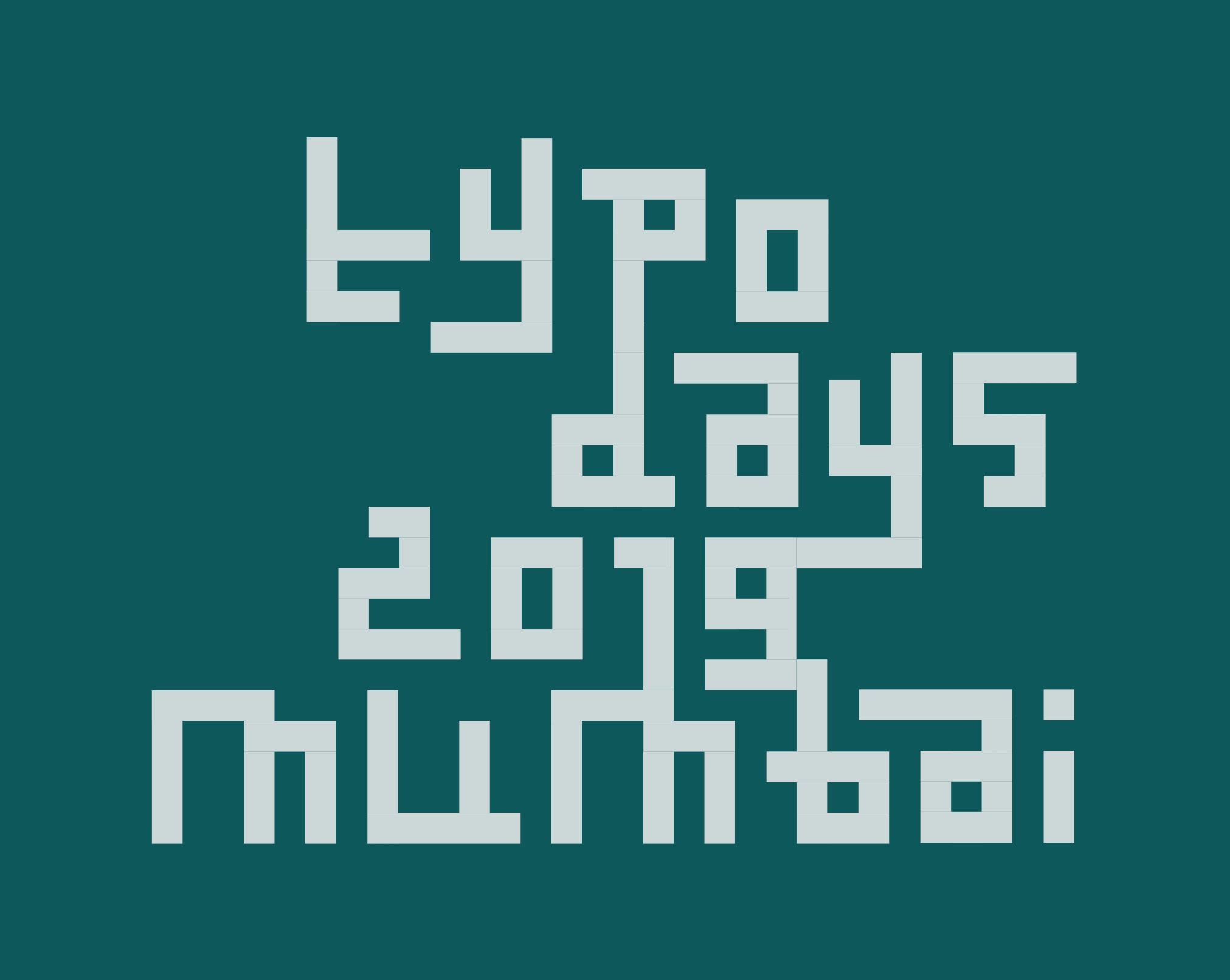
Logo ‘Typography Day 2019’ – Mumbai India, 2018