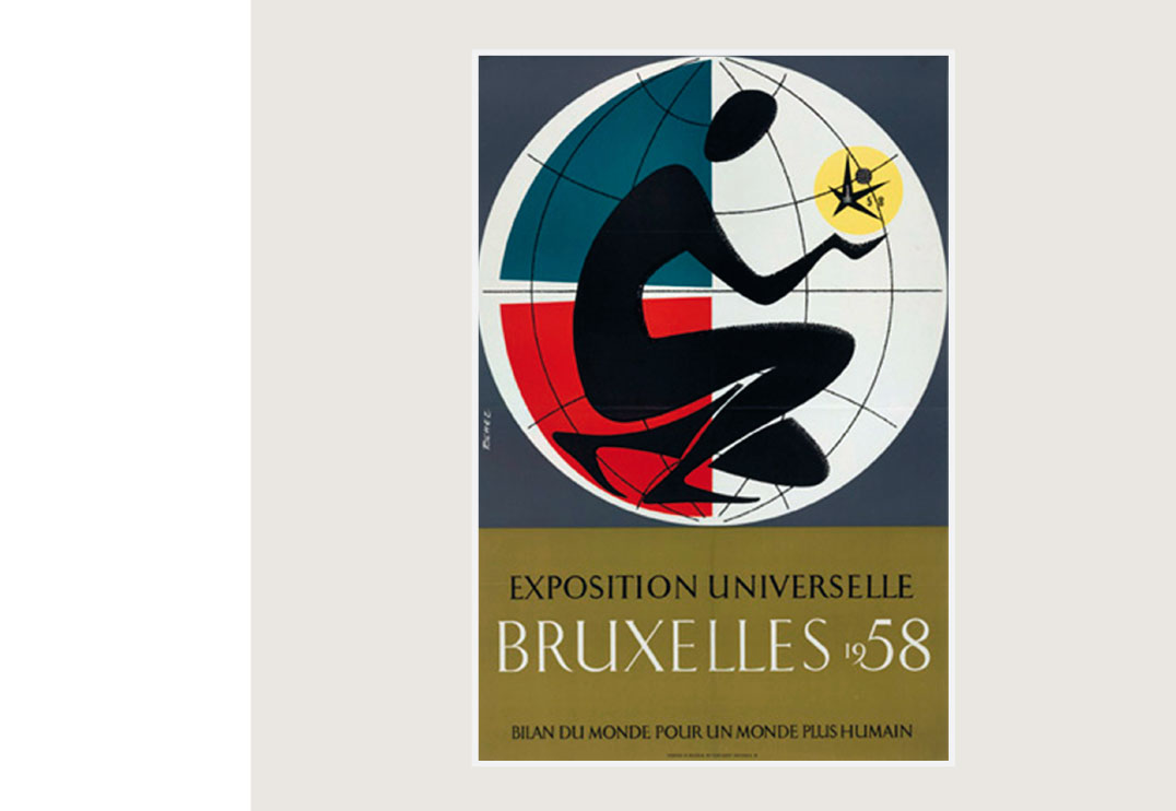
Poster « Universal Exhibition Brussels 1958 » by Jacques Richez 1957
 BACK
BACK
BRUXEL
JACQUES RICHEZ REDESIGNED
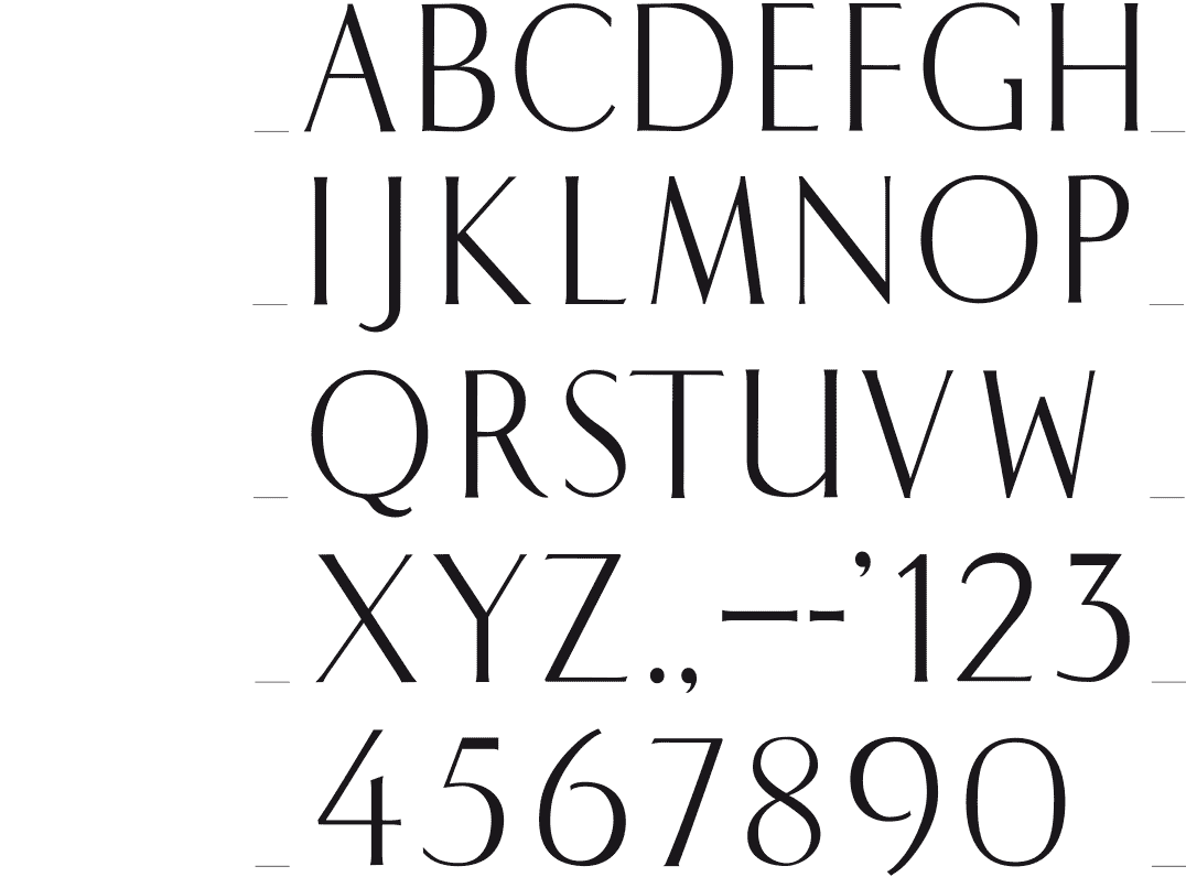
[1996] I was looking for a suitable typeface which to set the names of a series of carpet brands, and found nothing elegant and fine enough. So I thought of this type by Jacques Richez seen on a poster of the 1958 World Fair in Brussels. The font is classic of view and shows great skill. Especially, that posters until the 60s, were realized in lithography, and texts were drawn by hand or transferred using templates. The typeface has a nice tension between the different forms, it is gracefully styled especially when used in large sizes. It could be a derivative of a calligraphic as used by script sculptors.
To obtain certainty I submitted this issue to the typographer and graphic designer Dooreman. His answer: In my opinion it’s an amalgam of several fonts. We find the typically U in ao Perpetua, the B and R are very antique (Garamond, Van Dijck, ...) but above all it is a hybrid, not a true serif. The ‘serifs’ tend to Optima. I suppose it’s an original design.»
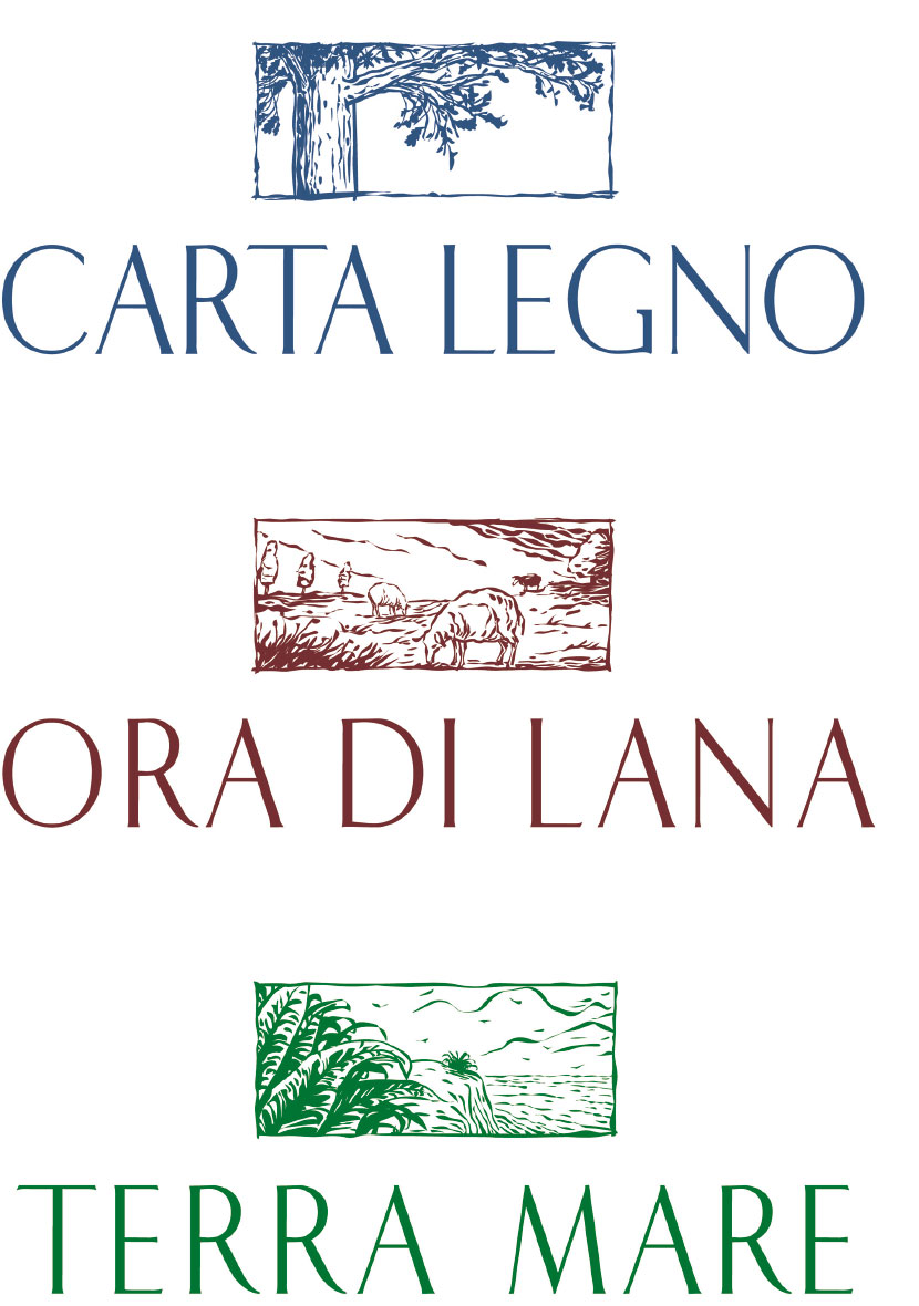
Logo « Carta Legno » paper and wood fibre carpets for Nash Andréa 1997
Name and logo for « Ora di Lana » a brand of wool carpets for Nash Andréa 1996
Logo « Terra Mare » sisal and seaweed fibre carpets for Nash Andréa 1997